The birth of DaisyDisk
DaisyDisk was started in late December 2008 as a result of half hour discussion between me (Taras) and Oleg, our coder. I proposed that it might make sense for us to create a relatively basic project in order to raise some money for something more serious.
The idea was simple: we create a disk visualization tool that can help one find out where the hell all the disk space has gone. By that time the only available applications of that kind for Mac users were GrandPerspective, Disk Inventory X and the like. All of those have mediocre interfaces and are built around the so called treemaps — the visualizations originally made for depicting disk usage.
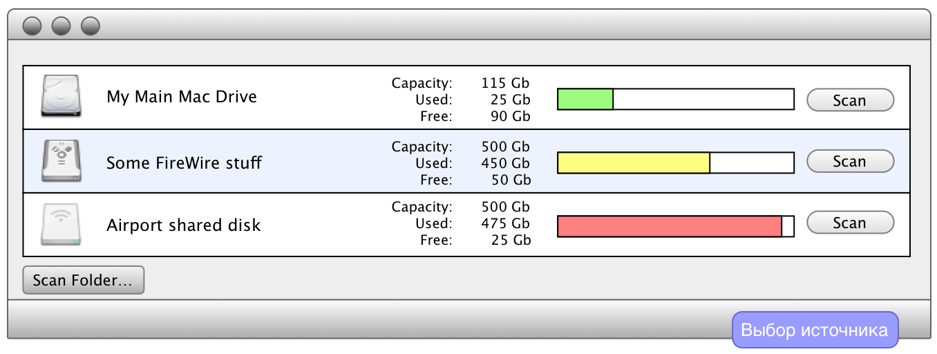
DaisyDisk, original mockup

Treemaps suck. They’re hard to read, they tend to shuffle all data on smallest changes, they’re messy and hard to navigate. Yes, one can handle these issues to some extent and certain modern implementations/researches can make them good enough, but still not good enough for us.
Another approach can be seen in applications that use the “sunburst”, basically a multilevel pie chart, slightly tuned for displaying folders tree. My favorite is Scanner while Linux users may recall Filelight — another similar implementation. Unfortunately for us all, the Mac version of Filelight has never been usable for any real-life tasks, remaining a mere shadow of its Linux ancestor…
It may sound naive now, but all we originally wanted was to create a Mac version of Scanner, just slightly more polished and usable. Display a list of sources, scan progress animation, resulting map. Profit!
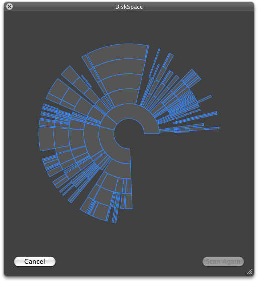
Animations, second mockup

If only…
The very first problems arose when we tried to build the sunburst map in progress of scanning, from the data we get on the fly. While it looked sane on paper, experiments proved us wrong. Very wrong. Despite all tricks, all we got was just a convulsing set of rings that hardly represented the picture we wanted. Fail.
We gave up the idea of re-using the sunburst as a scan progress indicator and concentrated on more important things. Soon enough we found that the original sunburst and many existing implementations suffer from some serious problems. The map looked “hairy” due to numerous tiny segments, large files outside the fifth ring were often invisible, segment coloring changed on each move, and overall navigation was quite a mess.
Working prototype

We’ve build several prototypes which helped us solve those problems and test our implementation on real-world data. For example, tiny segments have been consolidated into groups. This makes more sense than just hiding them, as in real life there are lots of examples of large groups of small files: folders with images, music or other files. In such groups, each standalone file is relatively small, but the total size of the group can be hundreds of megabytes. We also decided to display extra rings which help reveal space hogs hidden deep in the disk folder hierarchy. These extra rings are thinner, but provide useful information without the need for extra navigation. Navigation is another thing we can be proud of. The very first idea was to retain segment color during navigation. In other words, if ~/Documents is green, then ~/Documents should also be colored in shades of green. I have no idea why this has not been done years before…
The “blossom” animation was also a part of our plan on improving navigation. Earlier versions of DaisyDisk used different transitions, but with the same purpose: improve the navigation experience by smoothing map changes. Not even mentioning the “wow” effect it creates :)
DaisyDisk has been gradually enhanced, tuned and tweaked throughout the year, but this is a different story :)