First of all, we’re pleased to announce the upcoming update to DaisyDisk, version 2.0.7.
The first feature you’ll likely notice is favorite folders. Mark a folder as favorite and it will remain pinned to your list of sources forever. Not a big deal for occasional scans, but a real time saver for control freaks.
Scanning multiple volumes is now faster than ever thanks to the recent engine changes: DaisyDisk successively scans multiple volumes of the same hard drive, so the hardware load gets reduced and scan speed increases. This thing works automatically, you don’t even need to be aware of it.
The third interesting feature is related to the stand-alone version of DaisyDisk. Now, after the scan is complete, the application tells you if there’re significant amounts of disk space hidden in restricted folders i.e. taken by files and folders you are not normally allowed to access.
And finally, we’ve made a few tweaks and optimizations to DaisyDisk’s engine, so it handles folders with huge (no, huge) numbers of files without any hickups.
We hope to roll out this version in a week or two once we finish polishing all the stuff.
What’s next? There’re a few interesting things we have in a pipeline: I don’t want to reveal all the details right now, but we’ll keep you informed :)
One more thing. Starting from today we’ll try a more aggressive and flexible price model, so you should be able to get a premium quality product with a significant discount. We’re also considering separating Mac App Store and stand-alone versions of DaisyDisk by making certain (advanced) features only available in a stand-alone edition.
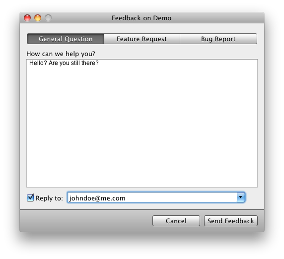
We love open source. DaisyDisk uses some popular open components that saved us hours of work. So, in order to give back something useful to the Mac dev community we’re making the code of our feedback component freely available.
We’re introducing DFeedback!
A small FAQ:
What license does it use?
We have chosen MIT License. It’s simple, it’s fair and it’s free of all the GPL’s bullshit.
Why not just use JRFeedbackProvider?
We used JRFeedbackProvider in the very first versions of DaisyDisk, but later replaced it with a custom component. While both look similar on screenshots, DFeedback has the following advantages:
polished look and feel
visual feedback for missing e-mail address when “reply to” is checked
optional system info (collected in the background, can be previewed by users)
Are there any downsides?
We haven’t build DFeedback as an all-purpose ultra-flexible component. It’s designed with DaisyDisk in mind, but you’re free to modify it to fit your special needs.
We are giving away 3 promo codes to DaisyDisk. Nah… Boring…
We are giving away 5 $10 iTunes cards… so you can download some annoying tunes…
Seen this stuff a million times, no cool. Let’s try something different.
This week we are celebrating the successful start of DaisyDisk 2 by giving away 12 greatgreat books. Most of these have already become live classics and well worth reading by just any person interested in design, data visualization and building software. Almost $500 for us — priceless knowledge for you.
Designing Interactions by Bill Moggridge, one the most inspiring books we’ve ever read. Great stories behind cult products like Mac, computer mouse or PalmPilot.
Rework and Getting Real by 37signals, an icy shower for startupers and beginning software developers. Two of the few books about business that won’t make you asleep.
Any of these books can be yours, no matter if you are in New York, Munich or Moscow. Refer to this article on MacStories for details.
Why are we doing this? We’re surely promoting our software, DaisyDisk, but that’s not all.
We believe we can make the world a better place by sharing books we’ve learned a lot from. So, if you happen to win one, improve your design skills and contribute back by creating a great website or application, that would be the best investment for us. Spending the same resources on buying ADs is merely useful for anyone ;)
Now these points of data make a beautiful line. And we’re out of beta, we’re releasing on time… …almost.
(XXI century, author unknown)
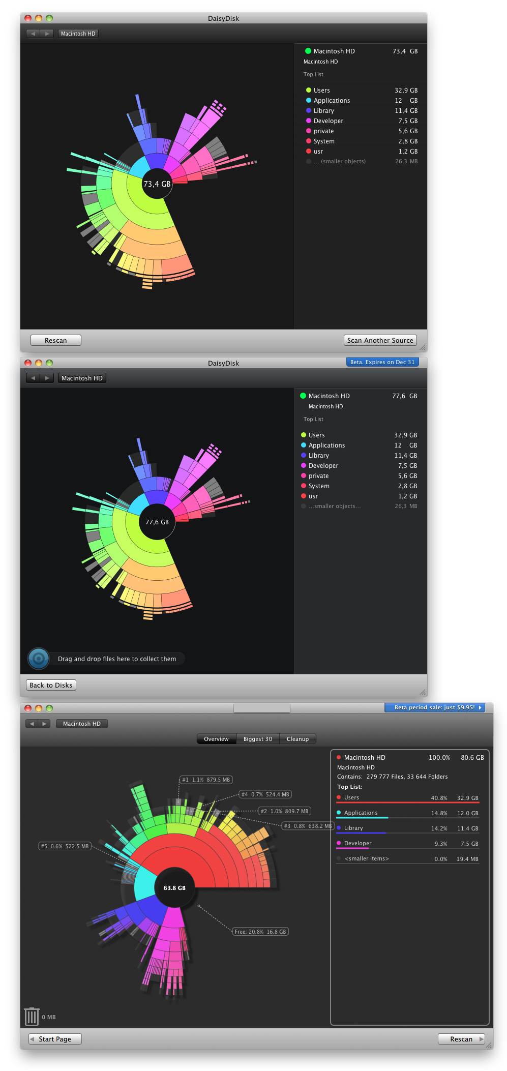
We’ve done it. After being in development for more than a year, DaisyDisk 2 is finally released and is available for everyone.
Version 2 is a major improvement over DaisyDisk 1 which many of you know and love: all main parts of the application have been re-written, refactored and improved:
In-app file deletion (yes, finally…)
Brand new look, the UI is rewritten on Core Animation
Ability to scan multiple disks simultaneously
Scan results are remembered while the application is running, can be “forgotten” to free memory
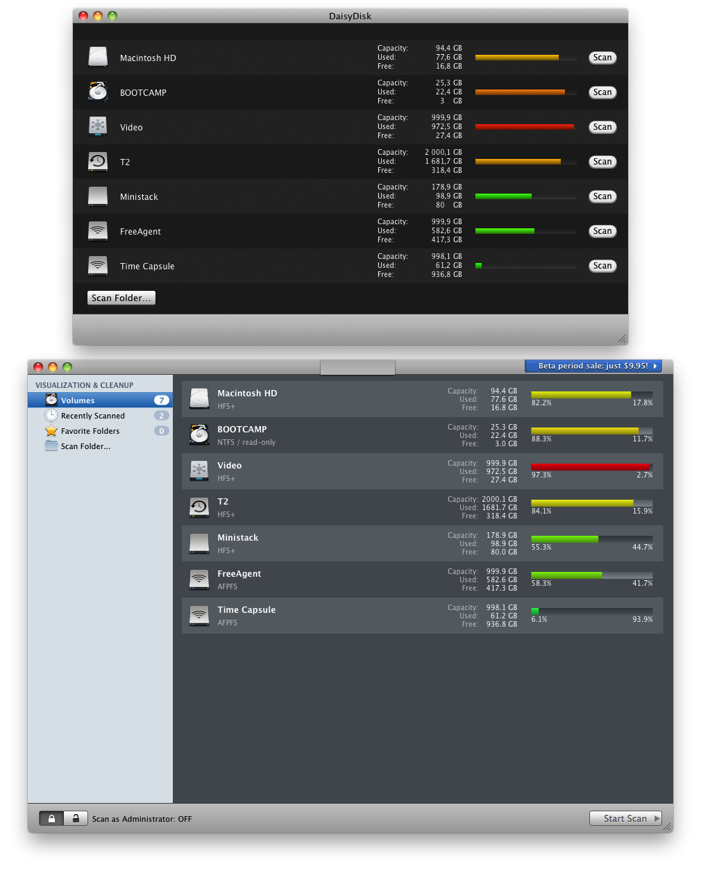
More informative disk descriptions, icon overlay for read-only volumes and folders
Redesigned Disk usage gauge
New scan progress indicator for the Dock icon
Scanned folders are added to the list of sources
New logic for scanning as Administrator (was Super-User): now you can only scan local volumes and folders
FileVault support
Support for multi-touch gestures (refer to the user guide for the complete list)
New error handling logic (yep, built-in dialogs suck)
New registration system (DaisyDisk 1.x keys will not unlock 2.x)
Redesigned About, Feedback, Crash Reporter windows
Twitter integration (quite useless, but fun :)
Major under the hood changes and tons of tweaks you’ll unlikely ever need to know about :)
Localization is temporarily dropped (we’re not accepting localizations for some time, sorry…)
Not bad, huh…
DaisyDisk 2 is available in two versions: stand-alone (classic shareware) and Mac App Store. You can read more about them in this document.
Our upgrade policy remains unchanged: free upgrade if you purchased a license before October, 15 2009 or after September 1, 2010. $9.95 otherwise.
Ok, but how do you know if your license can be upgrade freely or not? The easiest way to do so is ask DaisyDisk itself. Just download and run the application and it will guide you through the rest of the process.
Now a small FAQ:
DaisyDisk 1.5.3 is the final version of DaisyDisk 1.x; we still provide support for it, but don’t expect future updates.
DaisyDisk 2.x will continue to evolve, we plan some very promising improvements. And no, it won’t make coffee.
We do not offer refunds or redeem codes for users willing to migrate to the Mac App Store for free.
In the future “stand-alone” versions of DaisyDisk may have extra features, not available in the App Store as Apple’s review policy prevents us from adding certain functionality.
The final release of DaisyDisk 2 “stand-alone” is not unlocked with DaisyDisk 1.x keys, they must be upgraded online. Contact support if you have any upgrade-related issues.
So, what’s next? First of all, we’d liked to take a small break and finish some stuff.
We’ll also start working on a side project (no details right now, sorry…) along with preparing DaisyDisk 2 updates. There’re lots of things we have to do, especially with an emergence of Mac OS X 10.7 Lion which plans to be a very interesting OS.
DaisyDisk 2 debuts in Mac App Store and is available for purchase right now (direct link).
Now a small FAQ:
When the “stand-alone” version of DaisyDisk 2 becomes available?
We hope to finish everything in a few weeks. There’s still some work to be done.
I own a license for DaisyDisk 1, but it is not shown in the Mac App Store, why?
The Mac App Store has its own mechanism of registration and updates for apps, so it does not recognize the previously bought DaisyDisk licenses. The only way to make DaisyDisk managed by the App Store is to buy it again via the App Store.
Note: DaisyDisk may appear “Installed” in the Mac App Store, but the app will still not be managed by the App Store (updates, sharing the license across your Macs) unless the app was bought via the Mac App Store.
I own a license for DaisyDisk 1, how can I get the discounted upgrade?
The discounted upgrade will be available only as a stand-alone app and not as a Mac App Store app. You’ll be able to upgrade to DaisyDisk 2 once it’s available on our site. The upgrade policy remains the same: $9,95 unless your license key was issued before October 15, 2009 or after September 1, 2010. Otherwise free of charge.
Can I upgrade from a license for DaisyDisk 1 to version 2 for the Mac App Store?
The only way to do it is to buy the app via the Mac App Store at the full price. You cannot get a discounted upgrade from your DaisyDisk 1 to Mac App Store version 2, it’s technically impossible.
What’s the difference between the MAS and “stand-alone” versions?
The App Store version does not support scanning as administrator: the feature was removed to comply with Apple’s app submission policy. The MAS version does not support OS X 10.5 (no luck for PPC users) and update/registration mechanisms are changed to ones provided by Apple. Future versions may differ even more, a lot depends on Apple.
If I buy the App Store version of DaisyDisk right now, will I be able to exchange it for the “stand-alone” version later?
Very likely. We can probably just create a new stand-alone license for you. Note that the reverse exchange is not technically possible.
First of all, we’d like to thank all those people who supported us throughout the year. Users, bloggers, testers, contributors… You really helped us make a better product.
This year we’ve got a significant increase of our user base. It’s been interesting to learn that DaisyDisk is popular among photographers, designers, system administrators and Apple staff. Some people are even using it for taming multi-terabate data storages.
At the beginning of the year we released DaisyDisk 1.5, a significant update with lots of changes. Many of these improvements have been inherited from the early version of DaisyDisk 2 engine we’ve been working on then. DaisyDisk 1.5.3 is fast and rock solid. It’s also the last release of DaisyDisk 1.x: we need to move on and concentrate our efforts on DaisyDisk 2.
DaisyDisk 2 has been in development for a year and is now available for public beta testing. The “beta” is a release quality product which mostly lacks registration and some stuff tied to upgrade/purchase infrastructure. Once this work is finished, DaisyDisk 2 will be available for download to all users.
The Mac App Store version of DaisyDisk 2 has recently been submitted to Apple for review and if everything goes as expected, it should be available in early 2011.
With the success DaisyDisk has, there’s no wonder it’s been actively ripped off (these folks even copy portions of our site :)): The first DaisyDisk’s “version” is designed for Windows and emerged this summer. The second knock-off, by a Belarusian plagiarist, has just entered beta. Bear in mind we’re not affiliated with any of these “products” and not responsible for their inferior “quality” (i.e. the lack of it).
So, what’s next? In the beginning of 2011 we are to release DaisyDisk 2.0 and start working on updates which you’ll really love. Our basic principle “quality over quantity and user experience over features” has not changed, but rest assured we have some great ideas.
We also plan to expand our product line. Our next application will work on iOS devices (spoiler: this won’t be DaisyDisk for iPhone/iPad/iwhateverelse…) and it is a… well… we’ll let you known details when the time is right :)
Today we’re ready to introduce you to our newest creation — DaisyDisk 2 Beta
What has changed since DaisyDisk 1.5.3? Almost everything!
In fact, we’ve build most parts of DaisyDisk 2 from scratch.
Well, really, take a look at this short whatsnew:
In-app file deletion
Brand new UI, created from scratch on Core Animation
Ability to scan several disks/folders at a time
Scan results are remembered while the application is running, can be “forgotten” to free memory
More informative disk descriptions
Redesigned disk usage gauge
Scanned folders are added to the list of sources
New logic for scanning as Administrator (was Super-User)
New About window informs you about recovered space totals, allows you to tweet your results
Updated Feedback window
Redesigned Crash Reporter (we hope you’ll never see it)
New error handling logic (yep, built-in dialogs suck)
Major under the hood changes and tons of tweaks you’ll unlikely ever need to know about
What’s known to be missing/broken:
We haven’t switched to a new registration system, but DaisyDisk 2 beta accepts DaisyDisk 1.x license keys
Localization is dropped (we’re not accepting localizations for some time, sorry…)
Help file is missing (we haven’t finished working on it yet)
A few more things…
The beta expires on December 31, 2010.
If you buy now, DaisyDisk 2.0 will be a free upgrade for you (you’ll need to get a new key online once the final version is released).
Upgrade policy for existing users remains unchanged: $9,95 unless your license key has been issued before October 15, 2009 or after September 1, 2010. Otherwise free.
No matter how large is your hard disk, sooner or later you’ll run out of space. Gigabytes of movies, music, ever-growing picture archives and other “needful things” easily get out of control, especially if you use your Mac for editing movies, making music or simply download lots of data from torrents the web.
Let’s see what you can do about this…
Huge apps and fat binaries
Look at the /Applications folder and you’ll see that many Mac apps are sized 100-500 MB. And these are just daily use apps like iTunes (150 MB) or iPhoto (330 MB). Loving Steam games? Then add about 9 GB for Team Fortress 2, 8 GB for Left4Dead and 2 GB for Killing Floor or Portal and so on and so forth.
There is a way to nearly half the space occupied by the apps (not games, unfortunately :D). As you may know Apple has switched from PowerPC processors to Intel a few years ago, but there’re still lots of old Macs with PowerPC processors. In order to support both architectures many developers distribute their applications as universal binaries, also known as “fat binaries”. These applications contain two versions of the same app and you’ll likely never ever need one of them.
In addition to that, most Mac applications are localized, so a single application can be used by, say, both English and German users. That also has a cost of extra space being taken by data you don’t really need.
Why not just remove redundant localizations or support for processors you don’t even have? That shouldn’t be too hard, right?
Not really. In the real world we happen to live in a typical picture looks like this: you run a “binary stripper”, it reports saving you lots of disk space, but in a day or two you find out that some of the apps simply no longer work! That sucks. No, that REALLY SUCKS. It happens because some developers (Adobe, for instance) add integrity checks into their apps as an anti-piracy measure. If such an app finds itself modified, it thinks it has been cracked and quits immediately. To work around this, advanced “binary strippers” maintain a regularly updated “don’t-touch-me” list of apps, but it’s still a Russian roulette — odds are that some apps may stop working after such an “optimization”. Also note that if you update an app, it becomes “unoptimized” again, and you have to repeat the procedure over again.
As by the Murphy’s law, the apps that cannot be stripped are often the biggest space wasters (take a look at Adobe CS). At the bottom line, stripping binaries does not turn out to be a really big space saver, the typically reported figure being somewhere around a few GBs. It may still be worth the trouble for MacBook Air owners, where disk space constraints are especially tight.
Good riddance of unneeded apps
It’s so great that on Mac most applications can be installed with a simple drag-and-drop. However, there is a serious drawback of this approach when it comes to uninstalling the no longer needed apps. If you just drag-and-drop an app to the Trash, it will not remove any related data, such as configuration files and databases. While in most cases it’s not a big deal (maybe a few megabytes or less), some applications, like web browsers, may “forget” a gigabyte or two. You can see it yourself, just open the ~/Library/Application Support folder.
For example, on my Mac I have 1Password and Google Chrome that store over 1 gigabyte of their data, and Fontcase and LittleSnapper databases are also close to 1 GB. If I decide to trash these apps, all their data files will still remain on my disk, unless I remove them manually. Alternatively, I can use a special “uninstaller” app, like AppZapper, to have the cleanup job done for me.
The uninstallers also have their downsides. They may skip certain unneeded files or delete something useful. The good thing is that in most cases you can preview the files they are about to remove, and thus feel a bit more confident. At least, they don’t automagically damage random applications :)
Compress and archive
In Mac OS X 10.6 Apple has finally introduced the on-the-fly compression into the file system. Of course, in no way it’s a magic bullet for saving disk space, but it works pretty well on large portions of read-only data. It makes no sense to compress movies or music, but it can save you some space on applications or text documents. To enable the compression, you can exercise with the command line or just use an app like Clusters.
Mess my Mac
There is an undying myth, particularly widespread among people who recently switched to Mac from Windows, that their Mac needs regular “cleaning” in order to keep it “healthy”, that is to run smoothly and fast. The truth is that unlike early versions of Windows, Mac OS X doesn’t really need much maintenance, and if you don’t do it, in most cases you will not notice any difference. Besides, Mac OS X does some regular self-maintenance automatically, at times when you are away.
While automatic maintenance and “cleanup” applications may be helpful, be cautious when using them, and backup your system (Time Machine is your best friend). Always double-check the cleanup options, because it’s better to leave an extra megabyte or two than to find out that a chat history is missing or the “cleaner” wiped out something needful just because “it can”.
If you really (really?) think you need a maintenance tool for your Mac, use the tried and true and free Onyx application, and be careful with newborn “optimizers” from unknown developers.
Computers cannot outsmart humans
There is also a totally different approach to recovering your disk space, implemented in some other apps.
Instead of being “too smart”, they display a visual map of how your drive is used. Such a representation allows you to spot large folders and files in a blink of an eye.
Unlike the “slimmer” apps, the visualizing apps don’t rigidly delete some pre-defined set of files, no matter how large or negligibly small those files may be, but help the human make the decision and delete the biggest space wasters in the first turn.
I personally like this approach best (hell, otherwise we wouldn’t create DaisyDisk!), because it’s the most efficient one. Indeed, in many cases a lot of disk space is wasted by a small number of large files like archives, movies or cached data that somehow gets out of control. Automatic “trimmers” would not find those space hogs and could not understand they were lumber, while disk visualization tools give you a valuable insight about what’s really filling up your disks.
There’s no magic bullet
Once you’re really low on disk space, I’d recommend to scan your drive with a visualization tool like DaisyDisk. This will reveal the real space wasters, but it has its limitations. In order to get a few more gigabytes, consider removing a few apps or slimming them down with, say, Xslimmer or archiving your Applications or Documents folder with Clusters (it sometimes even makes sense to compress some rarely used documents to ZIP/7ZIP formats). Whatever you choose to do, do not forget to make regular backups — your data is way more important than disk space.